Using digital tools to create infographics to present data with ‘an agenda’
This blog post was produced after a request by one of my colleagues about how to use digital tools to produce infographics. The students were to be asked to produce infographics that present data that is ‘true but skewed’ to support a certain point of view.
Research the data to be presented
Before the students even start ‘Googling’ they need to predict the data they are looking for. What do they want the data to show? Who might have and share that kind of data? This thought process should give the students ideas of what the ‘search terms’ will be that they want to use.
For example:
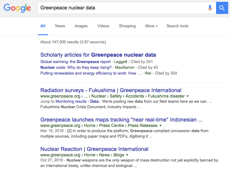
Googling ‘Greenpeace nuclear data’ gives a selection of possible ‘research leads’ within the first page of results, to a webpage such as this one:
http://www.greenpeace.org/international/en/news/Blogs/makingwaves/nuclear-delusions/blog/35617/
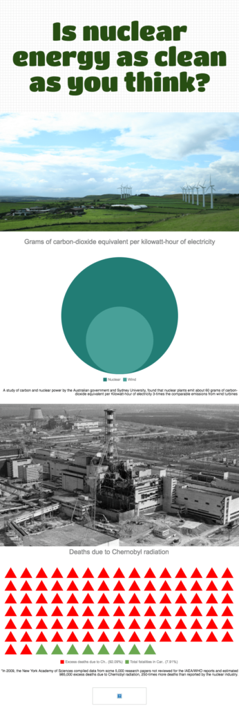
Selecting some data from this webpage:
“A study of carbon and nuclear power by the Australian government and Sydney University, found that nuclear plants emit about 60 grams of carbon-dioxide equivalent per Kilowatt-hour of electricity 3-times the comparable emissions from wind turbines.”
“In 2009, the New York Academy of Sciences compiled data from some 5,000 research papers not reviewed for the IAEA/WHO reports and estimated 985,000 excess deaths due to Chernobyl radiation, 250-times more deaths than reported by the nuclear industry.”
Students may then want to find statistics to act as a comparison to the data they are presenting to help emphasize the skew they are working on. What data point would act as a useful comparison to help students make their point? What could they use as their ‘search term’?
For example:
“number of people killed in road accidents per day”
https://en.wikipedia.org/wiki/List_of_countries_by_traffic-related_death_rate
Presenting the data as an infographic
My current preferred online application for producing infographics is piktochart.com. By going to piktochart.com staff and students can then choose ‘Start for free’ > Sign up with Google using their @ecolint.ch or @learning.ecolint.ch account. The free account provides enough functionality for the students although I will be looking to explore their Education PRO pricing in the future to evaluate what it offers.
This demo video from piktochart.com can be used, if needed, for staff and students to get support before getting started. The basic procedure is: Create new > Infographic > Free Templates > ‘It’s a blank template’. One the left hand toolbar > Tools > Charts. Users need to delete some of the ‘placeholder’ items entered into the blank template - they are just there to give ideas about the structure.
It is possible to quickly create a visually pleasing product in 30 minutes once suitable data has been collected.
For example:
https://magic.piktochart.com/output/18648684-is-nuclear-energy-as-clean-as-you-think